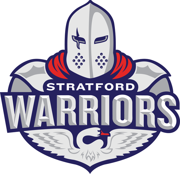
The Stratford Hockey Club and the Stratford Minor Hockey Association proudly unveiled their new logo on June 1, 2017.
The two hockey organizations offered a logo design contest last summer in their quest for a new, shared logo. Over 175 entries were received.
The winning logo, designed by Mike Lee of Stratford, maintains the traditional red and blue colours of both organizations but incorporates several classic Stratford elements...
 "With it, I’ve tried to create a design with layers of meaning for the City of Stratford. The focal point of the logo is the Warrior himself. An imagined knight of the Elizabethan era. This menacing knight would be the victor in any Shakespearean tragedy. In the lower part of the knight’s armoured crest, a powerful swan. Sentinel of the City of Stratford. Wings stretched wide in victory and a look of fearlessness. Subtler layers of subtext can be found in the twin “W’s” formed by the knight’s red cape. As well as a graphic representation of the Festival Theatre’s scalloped roof detail in the shadow of the knight’s armoured shoulder plates."
It all comes together in a unique and creative design — both organizations look forward to the fresh new look and are excited to bring their new logo to the ice for the 2017-2018 season!
GO WARRIORS GO!